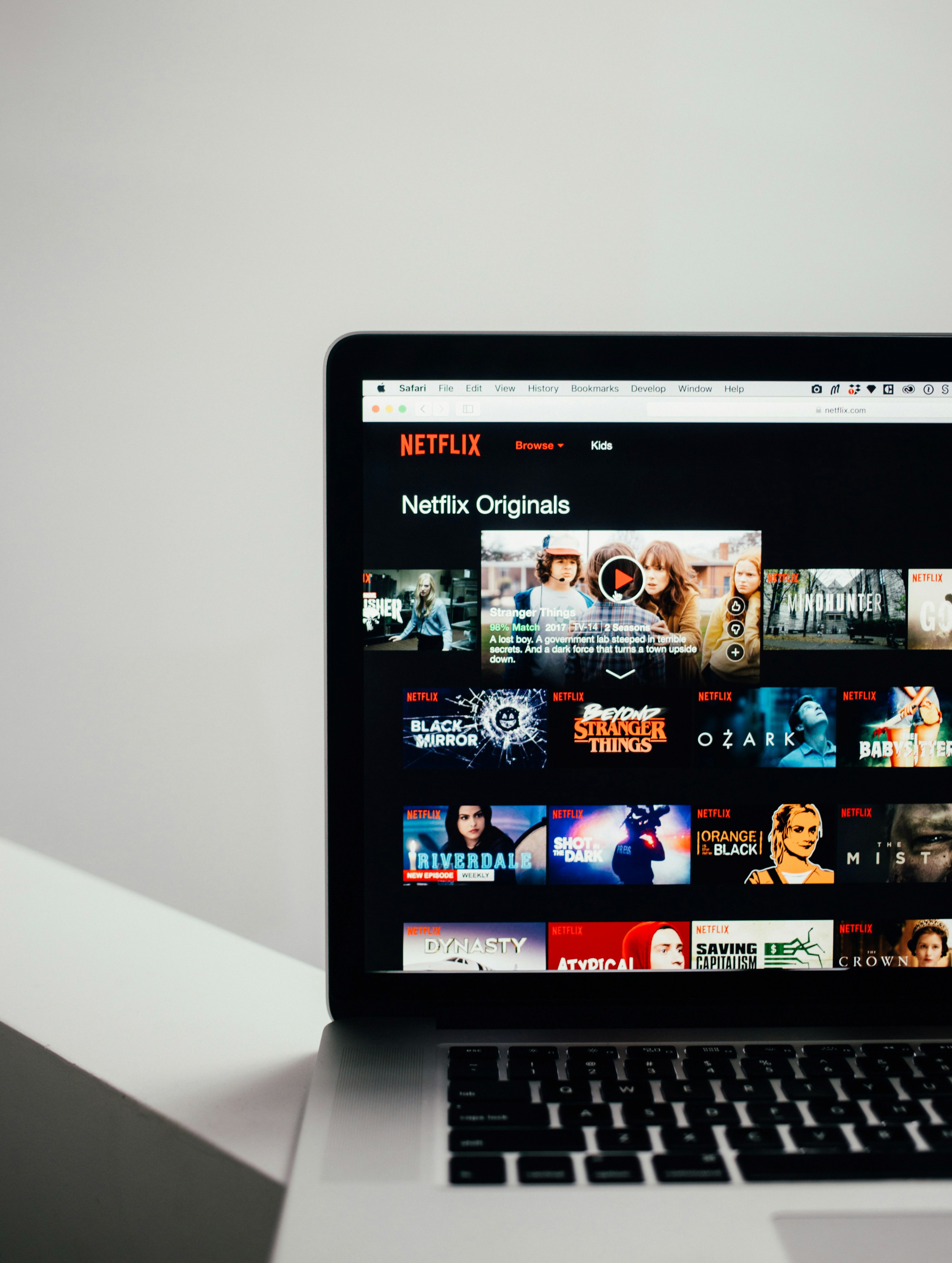
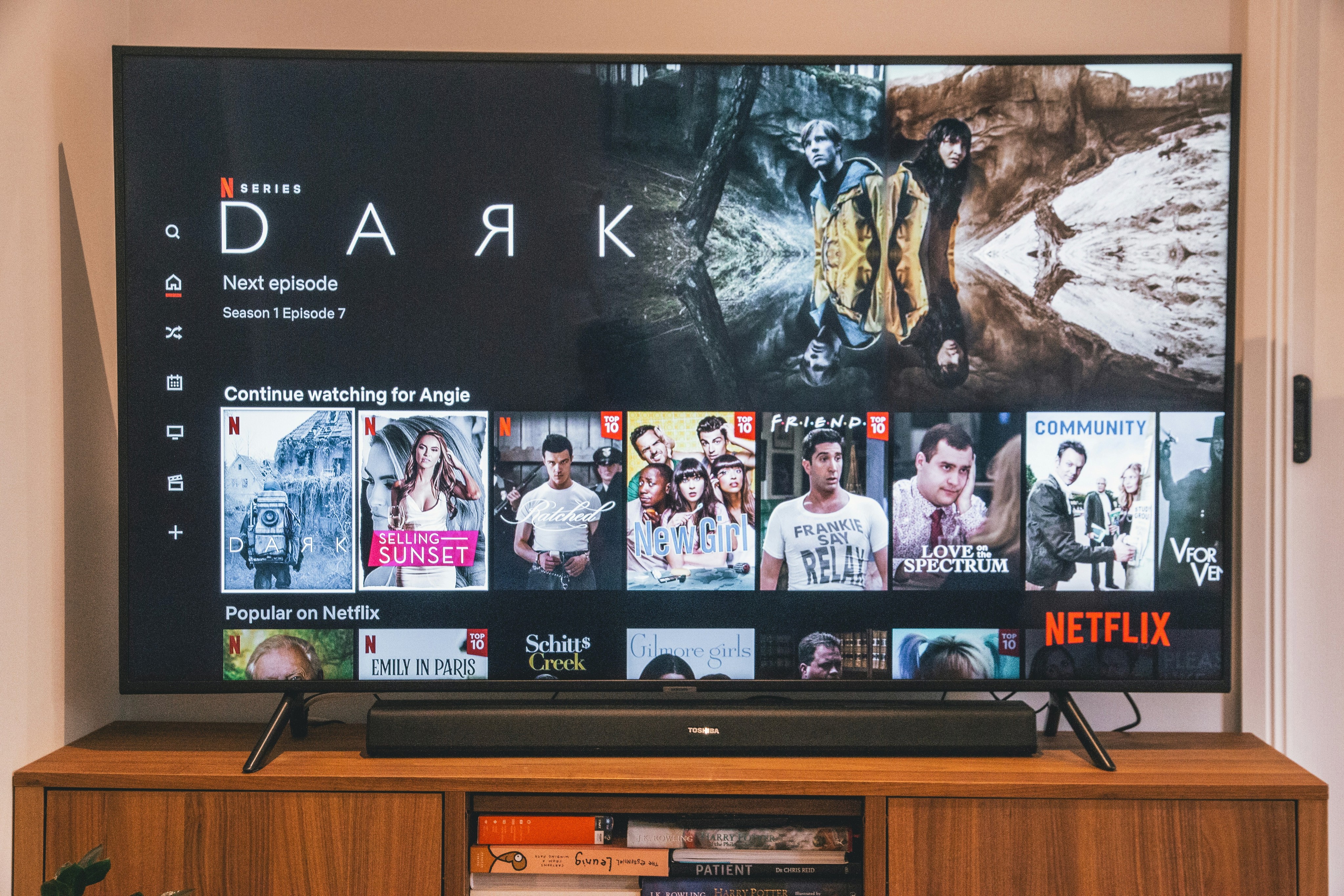
Netflix is awesome, but let's be honest – sometimes finding something to watch feels like work. Too many choices, weird categories, and that endless scrolling...it can get overwhelming! Our redesign aimed to tackle that frustration and make it easier for users to find something they'd actually love to watch.
We started with user research. Surveys, interviews, the works. Turns out, people want better recommendations, less cluttered menus, and maybe even a "surprise me!" button. Based on that feedback, we focused on a cleaner interface, personalized suggestions, and a fun way to explore genres you haven't tried before.
It's early days yet, but the data's good! Users seem to spend less time searching and more time watching. They're trying new shows and movies outside their usual picks. Plus, with streamlined navigation, they say it just feels smoother and more enjoyable to use.


